
COVID-19 case locations
Project overview
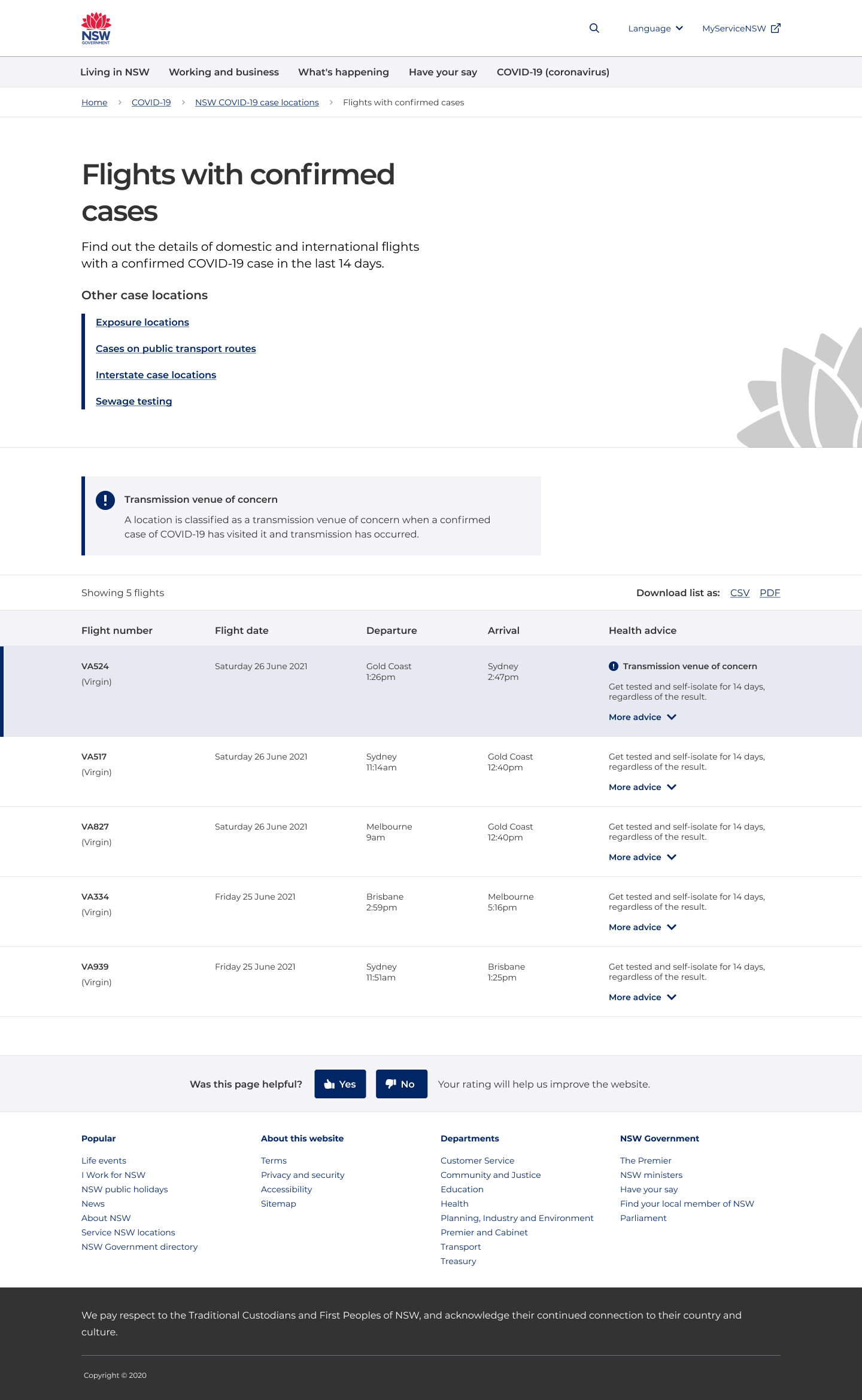
In June/July 2021 COVID-19 cases began to rise and there became a real need for case locations to be displayed in a clear and user friendly way on the nsw.gov.au website. At the time case locations were located on the NSW Health website and the data visualisation was confusing to customers and difficult to navigate.
I was set the task to improve the customer journey around case locations with a focus on usability, accessibility and UI design.
Hypotheses
Overall….
If we design a Case location landing Page that surfaces way-finding tiles:
it will be easier and faster for customers find the information they are looking for because we have implemented a more user friendly information architecture
it will introduce them to each category

Design 1: merged concepts
If we merge transmission venues of concern with other exposure locations…
customers will see all exposure locations, not just transmission venues of concern
customers will understand that the locations we have highlighted in blue are transmission venues of concern


Design 2: separate concepts
If we separate transmission venues of concern from other exposure locations…
customers will only see the transmission venues of concern list and think that’s all exposure locations as they will either think the page is finished
customers will be overloaded with information on this page and therefore not view the other case locations pages (such as public transport routes and sewage testing)

Objectives
identify if customers understand terminology of ‘case locations’, ‘exposure locations’, ‘transmission venues of concern’ and testing' and why each category is important
evaluate if customers find it easier to understand transmission venues of concern and exposure locations when they are merged or separated
identify if customers understand how to navigate between case location pages (e.g. flights, public transport routes)
identify what search terms people want to use to search the public transport routes list
identify how people want to search the sewage test results list
Methodologies
2 variation tests with 20 participants each involved:
first click tests
design surveys
Assessment criteria
percentage of successful first clicks
major themes (correct and incorrect) to comprehension questions
Key Insights
Terminology
Identify if customers understand terminology of ‘case locations’, ‘exposure locations’, ‘transmission venues of concern’ and testing' and why each category is important
the majority of participants thought that all 3 phrases, ‘case locations’, ‘exposure locations’ and ‘transmission venues of concern’, meant exposure locations
the majority of participants understand what sewage testing is and why it is important
Merged or separated
Evaluate if customers find it easier to understand transmission venues of concern and exposure locations when they are merged or separated
the majority of participants who viewed separate transmission venues of concern and exposure location lists did not correctly identify an exposure locations when asked. we believe this is because they saw the transmission venues of concern table as the full list of exposure locations and did not go down to the exposure locations table.
however, these participants who had seen the separate tables and been asked to define 'transmission venues of concern' later understood how to read a merged table better than participants who had not.
the majority of participants who viewed merged transmission venues of concern and exposure locations did not understand what the visual representation of transmission venues of concern indicated.
Navigation
Identify if customers understand how to navigate between case location pages (e.g. flights, public transport routes)
39 of 40 participants understand how to navigate between case location pages
Search terms
Identify what search terms people want to use to search the public transport routes list
train number e.g. ‘T4’
the word ‘train’
train line name e.g.
start and destination stations
Search preference
Identify how people want to search the sewage test results list
the majority of participants (27 of 40) would use the search bar (68%)
8 participants would use control F
4 participants would read through the suburbs listed on the left of the table
Overall findings and recommendations
Understanding the concept, ‘Transmission venues of concern’
The majority of participants think ‘transmission venues of concern' means 'exposure locations’. Participants understood that these were places a COVID-19 positive person has been, and that others there at the time were exposed, but not that someone has caught it or that COVID has been transmitted between people.
however, participants who were asked to define 2 separate concepts (‘transmission venues of concern’ and ‘exposure locations’) were later able to see the difference more than participants who had not
This indicates that presenting transmission venues of concern as a separate concept from exposure locations leads to higher understanding (eventually)
Separating transmission venues from exposure locations
The majority of participants (14 of 20) did not correctly identify the exposure location they were asked about, and instead identified the transmission venue of concern in the same suburb.
We know that most participants did not understand the difference between transmission venues of concern & exposure locations, but we also assume that most participants did not scroll past the first table to see the exposure location list.
This indicates that separating the lists poses the risk that customers will not see all exposure locations.
Merging transmission venues with exposure locations
almost all participants understood that the exposure locations represented in blue were more important.
however, the majority of participants did not understand that we were visually representing transmission venues of concern when they were merged in a list with all exposure locations. (specifically, that someone caught COVID-19 at these locations.)
it’s most likely that the lack of understanding of the concept of ‘transmission venues of concern’ caused this misunderstanding.
Main recommendations
Wording: Experiment with different terminology to ‘transmission venues of concern’
Provide a definition and context around transmission venues of concern both:
Before customers reach the list
In context of the list
Hierarchy: if there needs to be 2 lists, place the merged list above the transmission venue of concerns list
Visual communication: Experiment with a different visual representation of ‘transmission venues of concern’ - this will go hand in hand with different wording.
Work with NSW Health to get an automated feed for the public transport routes
Next steps
continue iterating on content, IA and UX
decide on approach to transmission venues and exposure locations
get approval to develop designs