
Navigation
NSW Government
In 2019, the NSW Government website was given the green light to migrate over 500 Government websites into one central, customer-centric site. To support the consolidation and migration of these websites I was employed to assist the NSW Government Digital Channels team in creating new reusable components, designing template layouts, wireframing, generating high fidelity prototypes, analysing quantitative and qualitative data, participating in user research and implementing UX/UI improvements to the current design system. This role also required the application of design best practices and standards while focusing on accessibility, human centred design and a mobile first approach.
In order to achieve this I built strong working relationships and effectively collaborated with:
the Digital Design Systems team
internal and external stakeholders
internal and external developers
designers and researchers from the UX team
content designers
accessibility specialists
Project overview
I was asked to investigate the navigation across desktop and mobile and identify where UX/UI and accessibility improvements could be made to foster a customer-centric experience for our users.

What were the problems?
While we were migrating countless new websites into nsw.gov.au it became apparent that our navigation for mobile and desktop needed improvement.
1. The desktop and mobile menu only had one tier
This made navigation extremely difficult for customers and forced them to heavily rely on search, side navigation and breadcrumbs. Additionally, this became a significant problem on mobile as those supporting forms of navigation had been compacted for responsive design solutions.

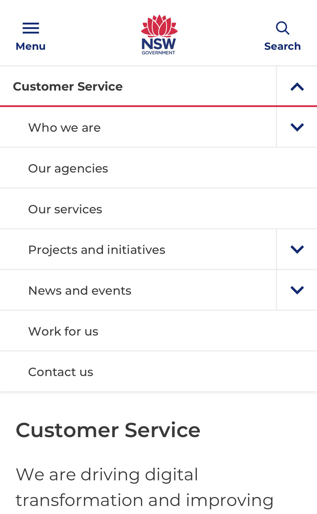
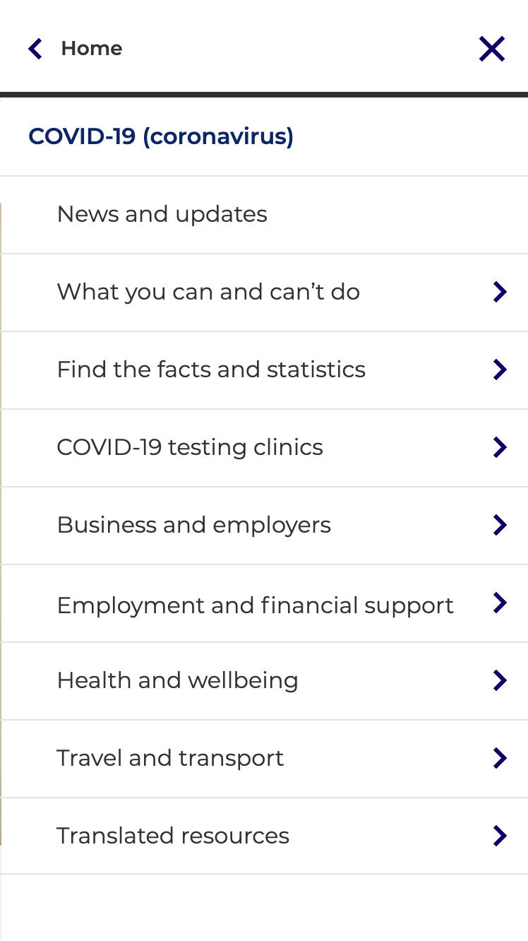
One tier navigation and side navigation
2. The side navigation was being missed by users on mobile
Most of our customers used the desktop side navigation to navigate between similar tasks and to recover from navigational error. On mobile this was not the case. The side navigation was condensed to a dropdown accordion located at the top of the page. Through guerrilla testing, I discovered that our customers would either scroll past it, click on the hamburger menu or reference a preference for search.
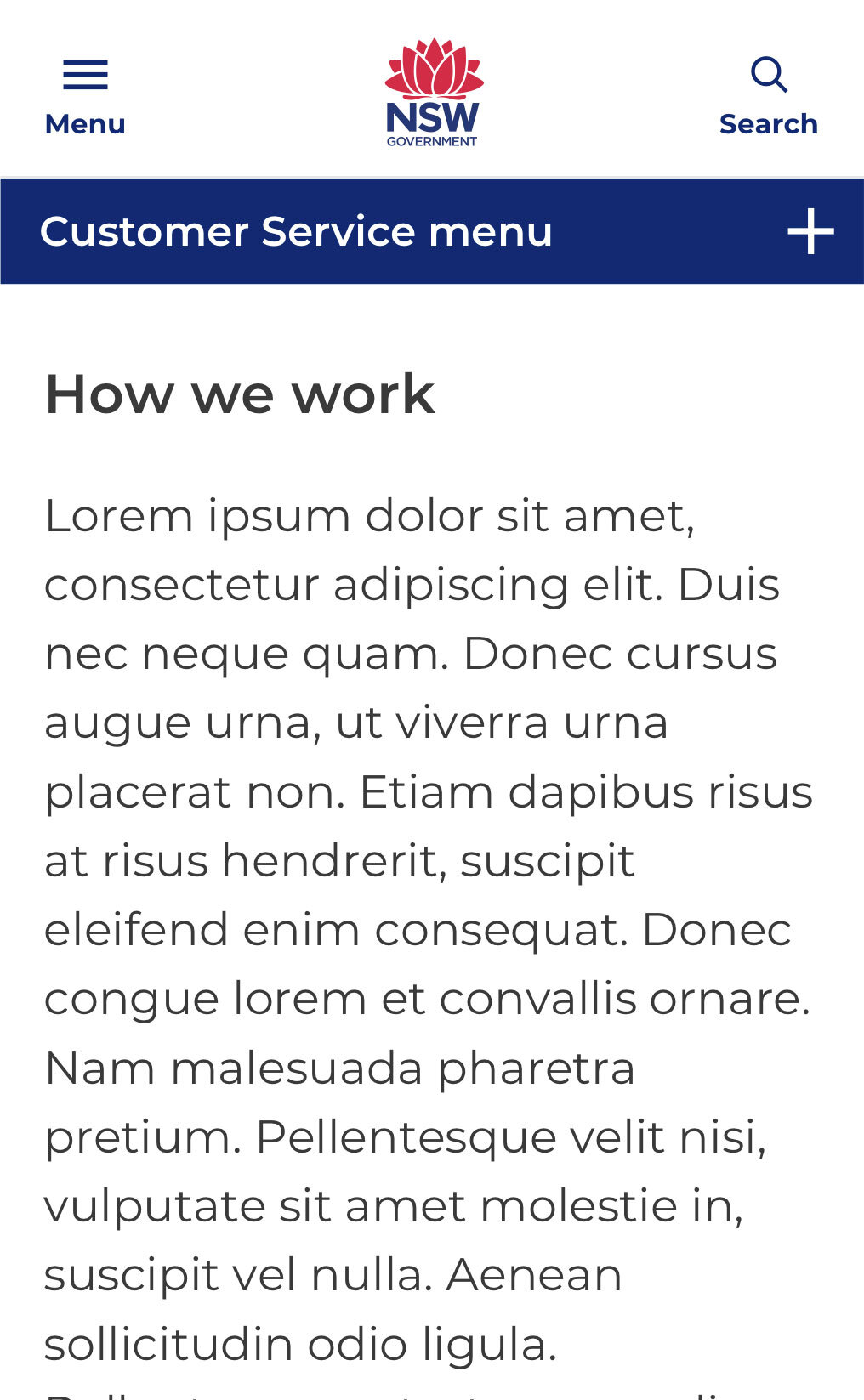
Examples of the original side navigation accordion designs that failed testing
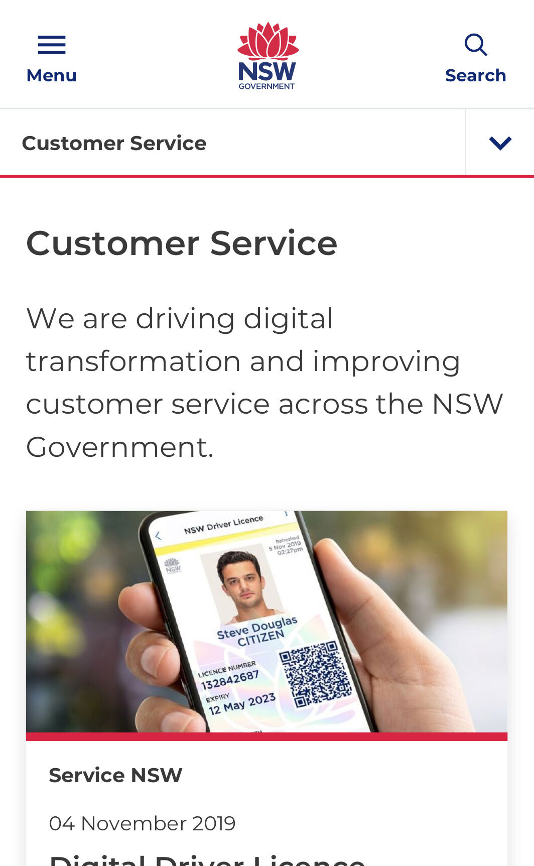
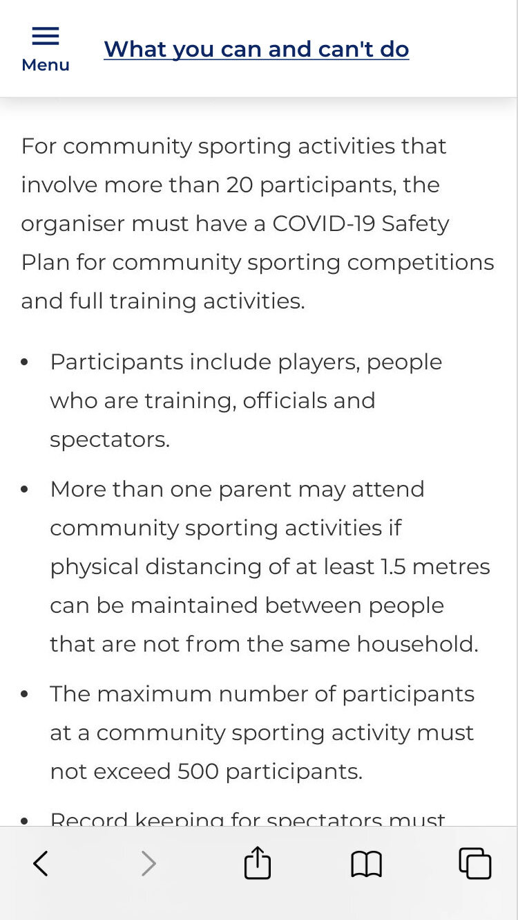
3. The pages had too much content and the content was buried in accordions
This made pages extremely long and customers struggled to find buried content. Through data analysis and heat maps I could see that our customers were not scrolling very far down the page and were often clicking on inline links located at the top of the page. This presented the problem that potentially important and relevant information was not being surfaced effectively.
Suggested improvements
Desktop
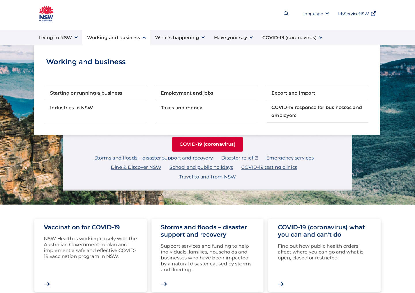
Turn on the dropdown menu to provide two tiers of navigation

NSW Government homepage
Mobile
Allow navigation through multiple tiers
Design contextual mobile navigation to show customers what page they are currently on and what related pages surround them
Merge side navigation and breadcrumbs into hamburger menu to reinforce one source of navigation
Introduce a ‘sticky’ menu so that customers would not need to scroll back to the top of pages to navigate


Desktop + Mobile
Reduce content on long pages by separating content out and creating individual content specific pages
Introduce wayfinding pages to allow customers to ‘drill down’ to relevant content

Hypotheses
A user can complete very different tasks in one session, if we provide a way to navigate between top tier navigation items.
A user can complete a task from the nsw.gov.au homepage, if we provide dropdown/hamburger menu.
A user can navigate to content that has an affinity to a page, if we provide wayfinding pages or dropdown/hamburger menu on pages.
A user can recover from navigational error if we provide wayfinding pages or side menu on content pages.
Key insights - Mobile
Using qualitative research methods I designed a range of moderated task-driven activities to be tested on both mobile and desktop.
Hamburger menu
All participants easily located the menu and were able to consistently find the menu throughout all tasks.
All participants used the menu in its ‘sticky’ state.
Side nav integration into main menu provided easy navigation for users within similar topics.
Navigating levels
All participants were able to navigate up and down multiple tiers in the navigation to find the relevant information.
Overall, participants preferred to click on categories in the menu level they were in rather than go back to the previous menu level, unless the topic was definitely not in the categories presented.
Wayfinding pages
All participants successfully used the way finding pages on mobile.


Key insights - Desktop
Dropdown menu
All participants used drop down menu to navigate.
Participants returned to drop down menu to recover from navigational errors.
Participants clicked on multiple drop down menu headings to find relevant section below, which reduced navigational error.
Wayfinding pages
All participants used way finding pages to navigate between tasks.
Participants returned to way finding pages to recover from navigational errors.

Side navigation
All participants used way finding pages to navigate between tasks.
Some participants use the side navigation to recover from navigational errors.

Further insights
Search - 70% of participants referenced a preference to search across mobile and desktop.
Breadcrumbs - On desktop all participants used breadcrumbs to either navigate or to understand where they were on the site.
In-page navigation - All participants used 'On this page' to navigate to relevant sections on mobile and desktop.
Taxonomy - The taxonomy effects the usability of the navigation.
Scrolling - Some participants would assume the page they were on would have relevant information and continuously scroll to find it, therefore struggling to complete the task.
Home page - Some participants would navigate to the home page when struggling to find information.
Next Steps
Drop down menu - Turn on drop down menu and monitor with quantitative research methods.
Scrolling - Further testing on how to use sticky nav to support scrolling behaviours.
Hamburger menu, Side navigation - Discovery on how to address IA, topics and breadcrumbs.
Taxonomy - Test the navigation with neutral taxonomy (e.g. groceries)
Learnings
Assisted with facilitating user research
Upskilled in Axure prototyping